AllWell
Healthcare Management and Support for Family Caregivers
Type UX Course Project
Role Research | UX | UI
Time 7 mo | Sep 22 - Mar 23

PROBLEM
A Heavy Burden
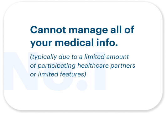
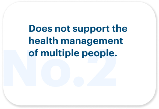
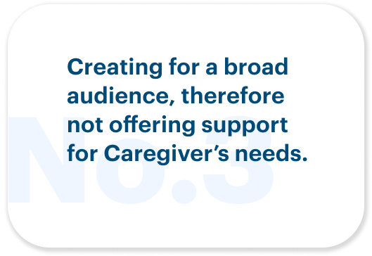
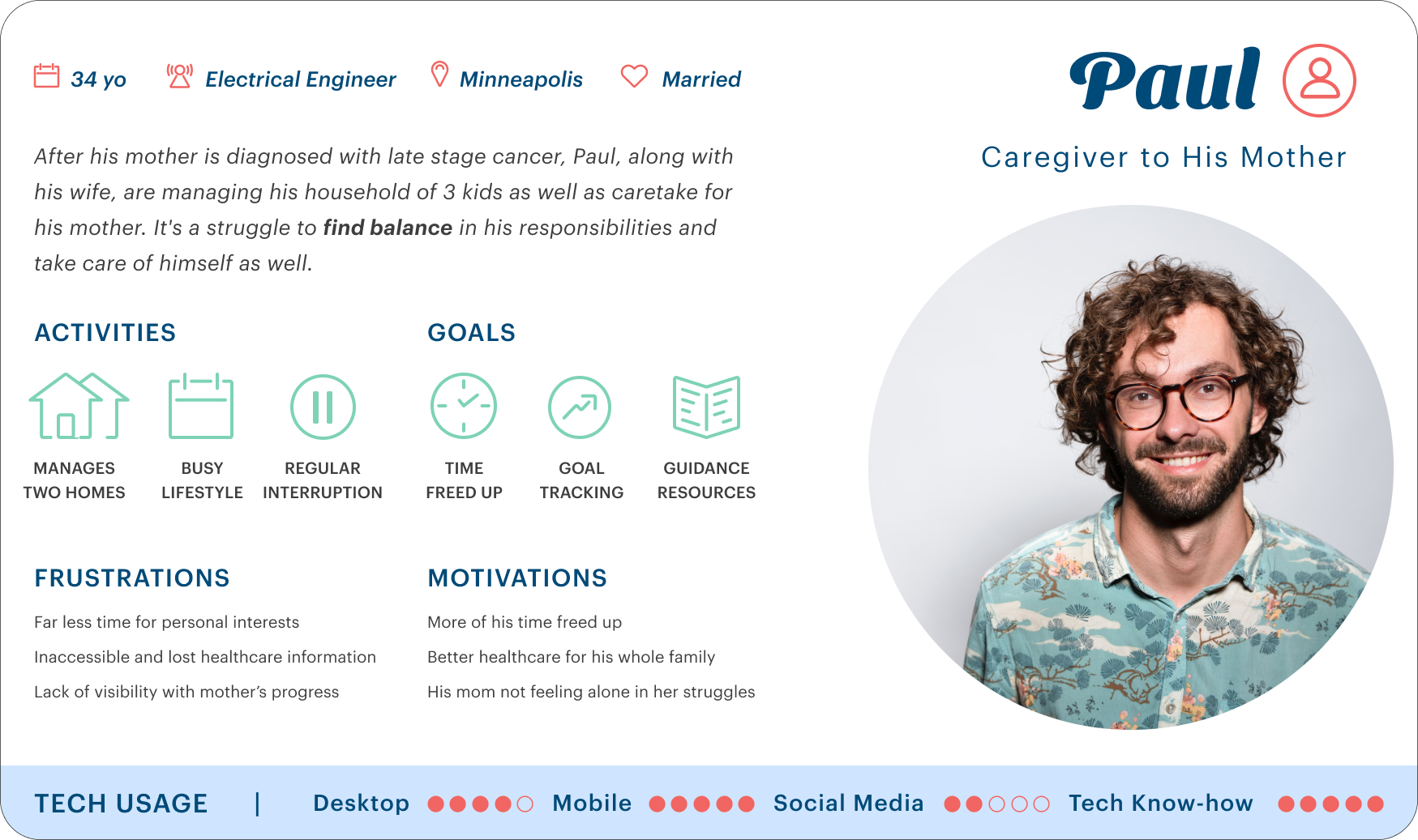
Caregivers have a difficult time managing healthcare needs for themselves and their dependents because information and support are spread across several different entities.

POTENTIAL SOLUTION
Lightening The Load
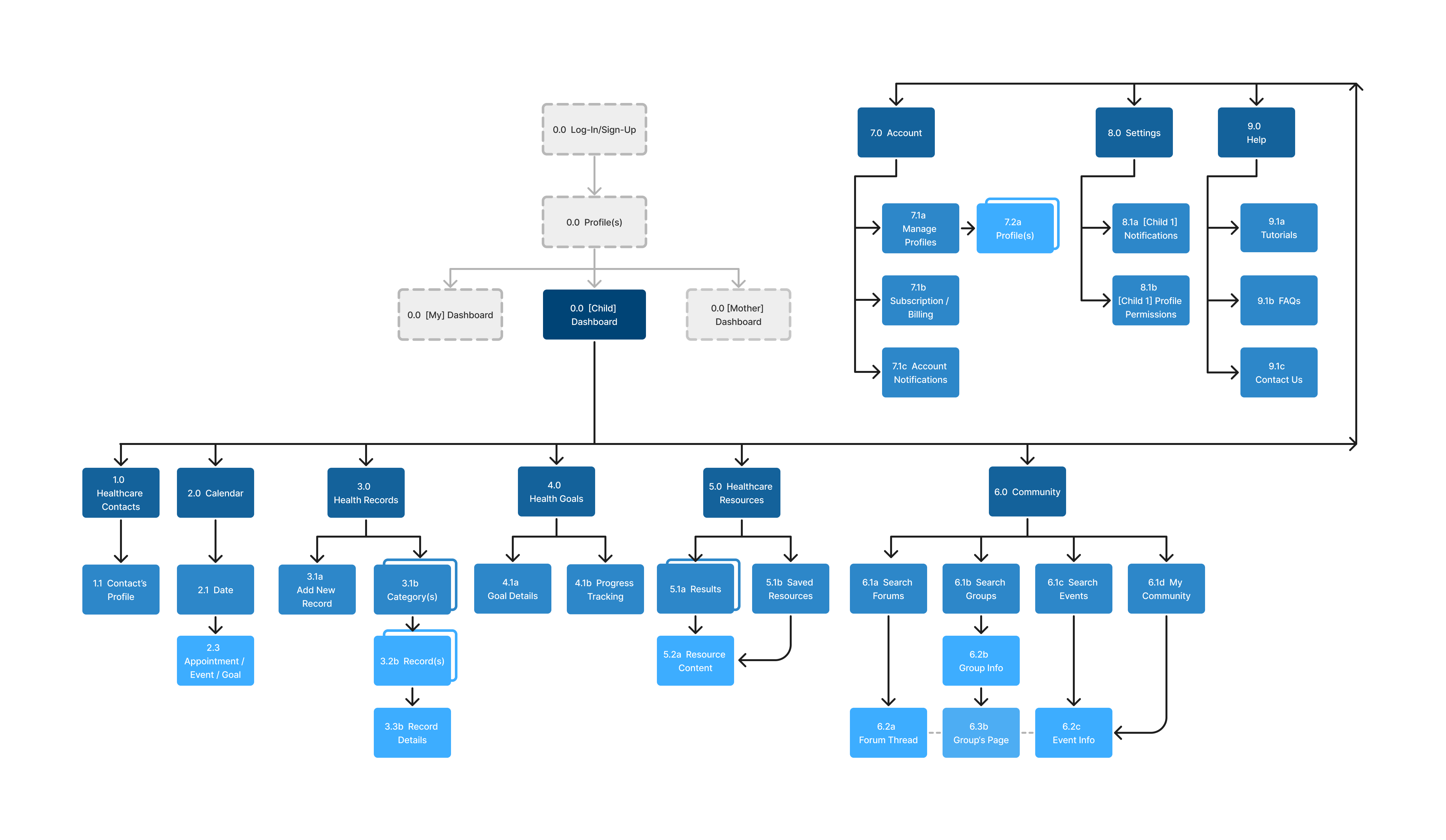
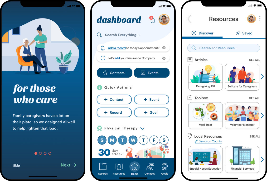
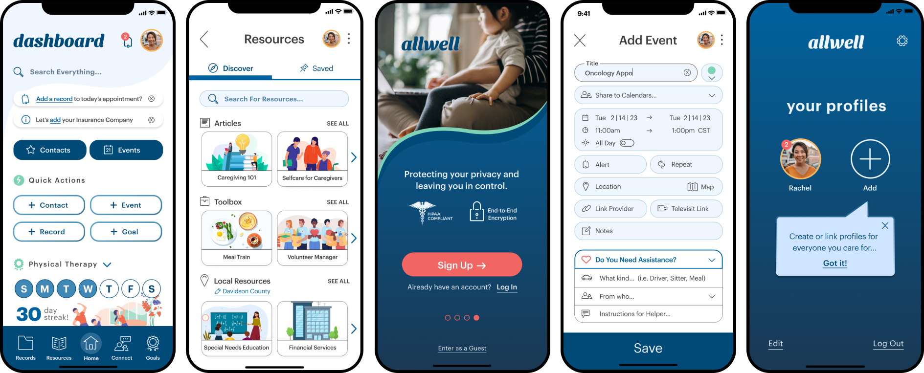
A tool created with a Caregiver’s needs in mind. Designed to save them time and energy by offering a central location for medical records/info, support, resources, and goal tracking.
Source: Caregiver Statistics: Demographics - Family Caregiver Alliance. Available at: source link

USER INTERVIEWS + AFFINITY MAPPING
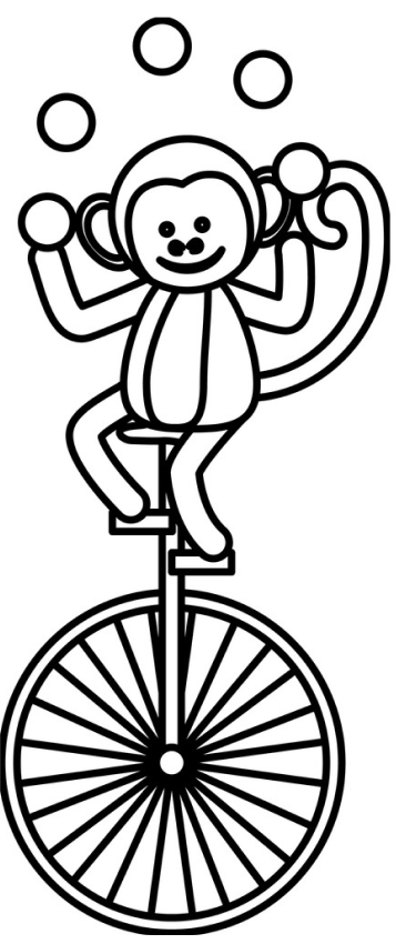
“I feel like a circus monkey juggling all the plates”
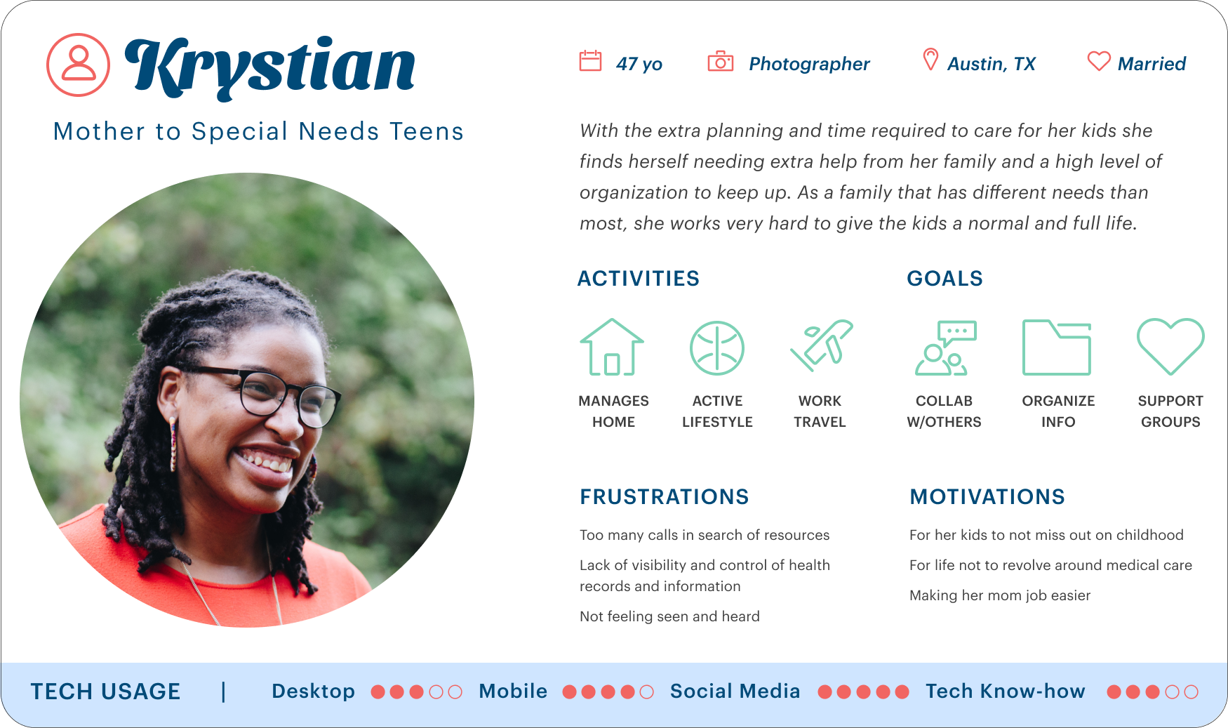
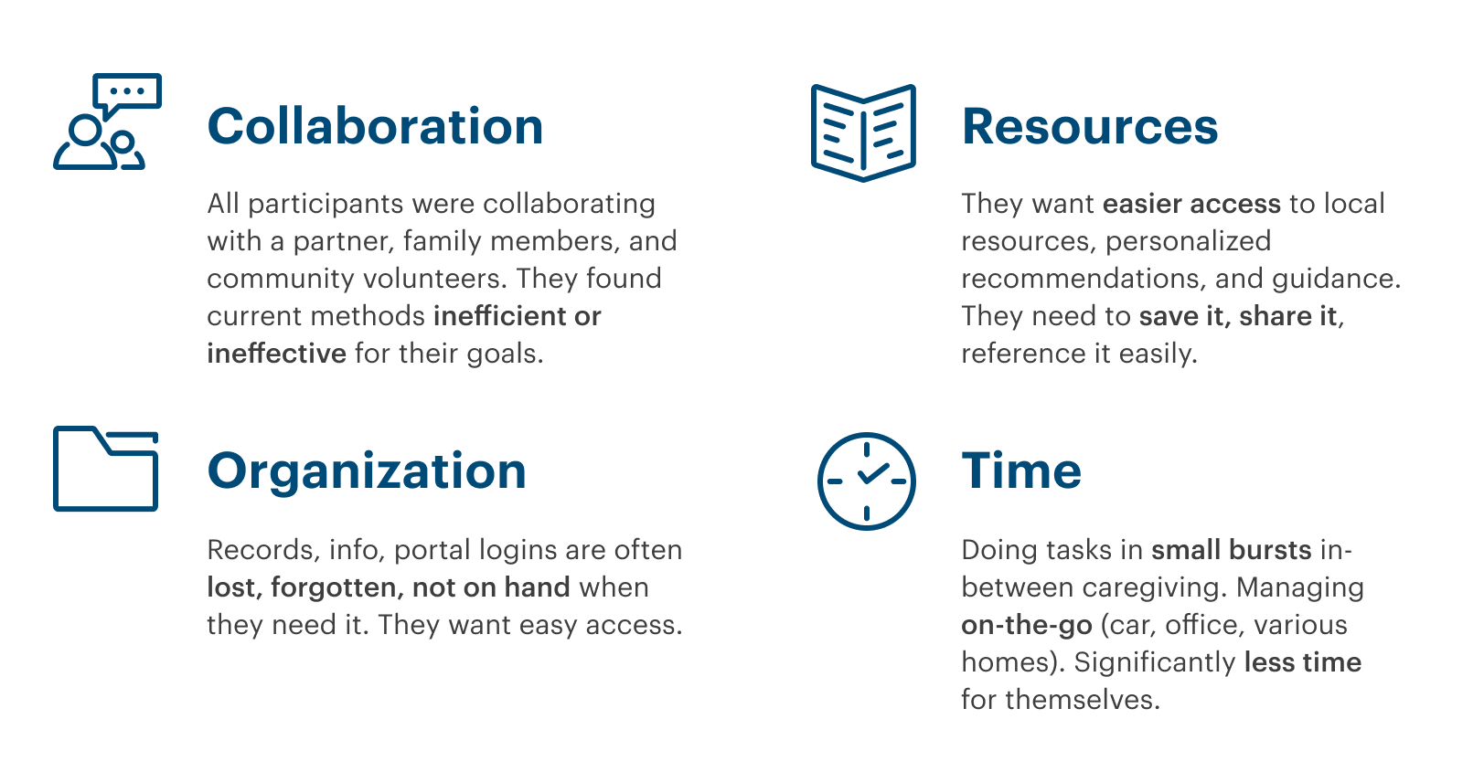
I conducted User Interviews with 5 individuals within the target demographic. They were currently primary caregivers for an adult or child with special needs.

USABILITY TESTING
It’s alive!
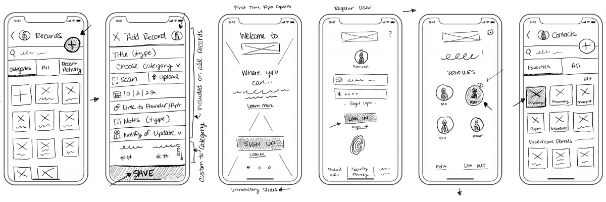
With a mid-fidelity prototype in hand it was time to test it with 6 individuals within the target demographic.
GOALS
Discover errors and gauge satisfaction with 4 main features:
- Sign Up
- Connect with Provider
- Add Health Info (Event & Record)
- Save an Article (Resource)

BUSY & DIFFICULT FINDING CONTACTS
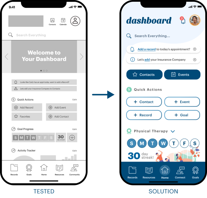
Reorganize the Dashboard
It was taking some users too long to find things on the dashboard, particularly Contacts and Calendar. I dropped them down into the content section next to Quick Actions – one of the first places users went to complete a task.
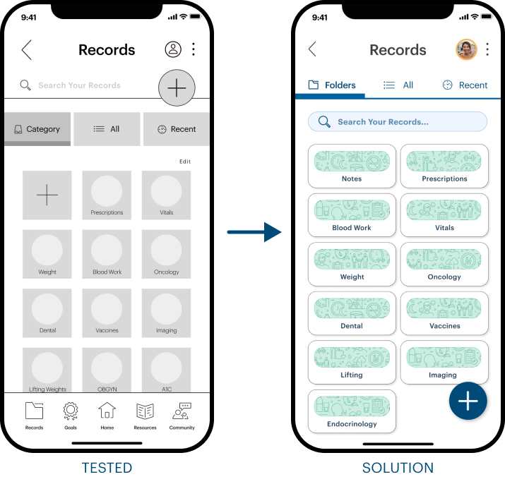
CONFUSED BY TWO PLUS SYMBOLS
Consolidate Add Feature
Users went to the wrong plus symbol in order to 'Add Record'. I put the plus symbol for adding a Folder in another menu and moved the plus sign to the bottom where users are used to seeing a FAB. Bottom nav wasn't needed.
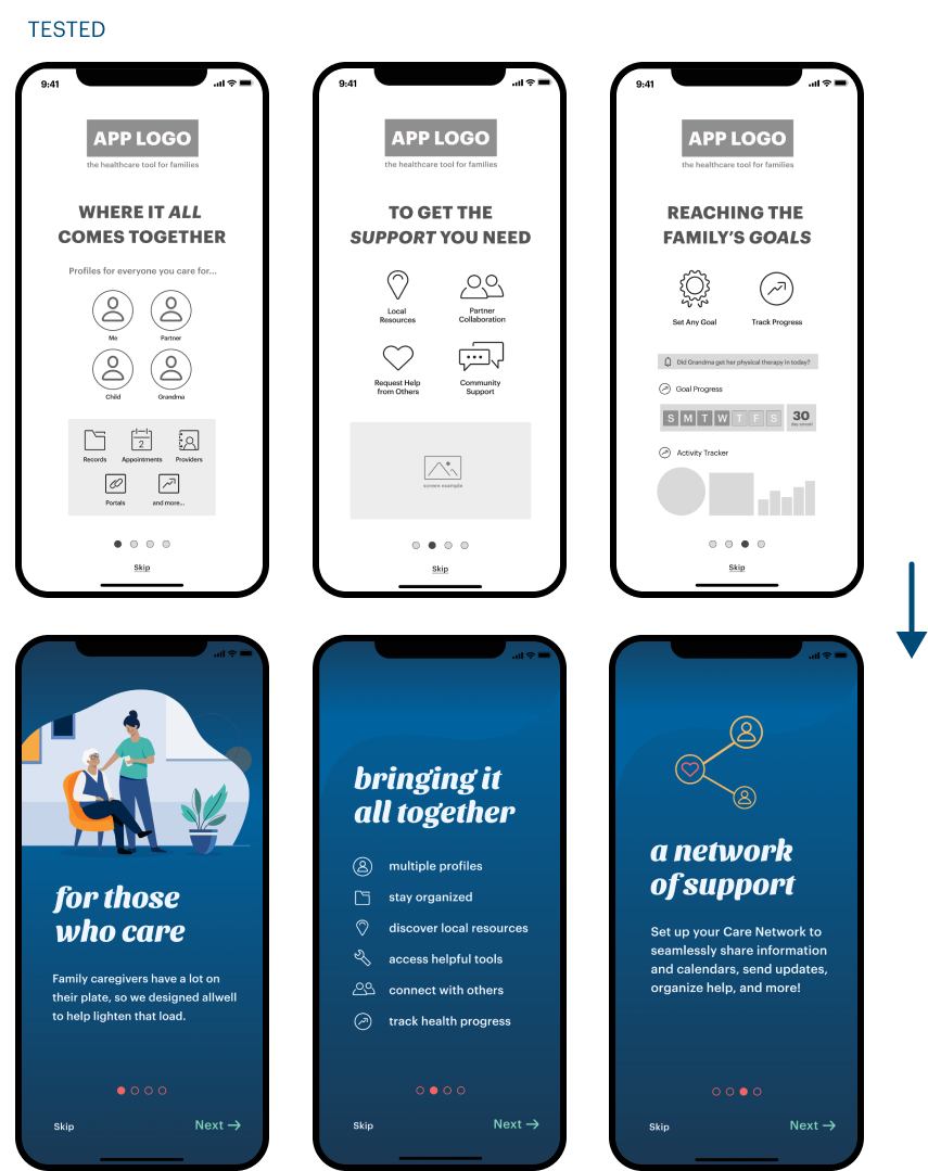
A BUSY FIRST IMPRESSION
Simplify Introduction
Feedback indicated that users felt it was too much on each screen. I worked to remove anything that was not essential and focus on a first impression that doesn’t overwhelm. Added ‘Next’ button after several users weren’t sure how to progress in the intro.


Wrong feel or association.
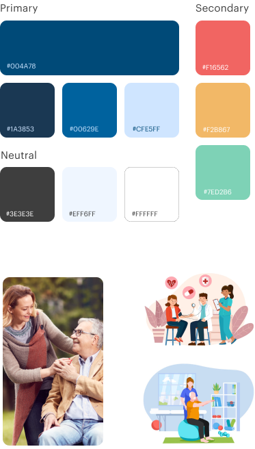
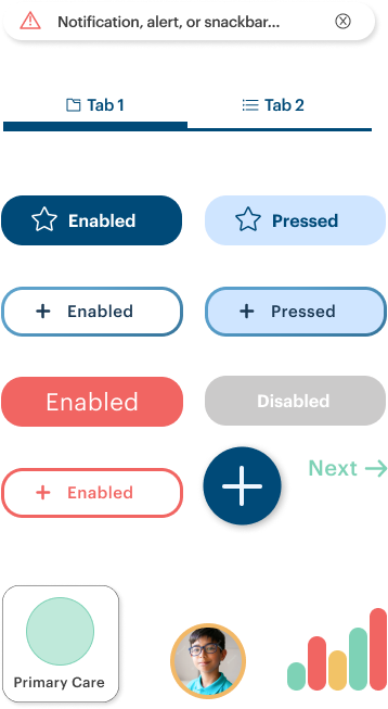
A preference test assisted in seeing what people gravitated toward. How to use a (preferred) pinkish-red without saying stop, cancel, or error!

Throwing the excess out.
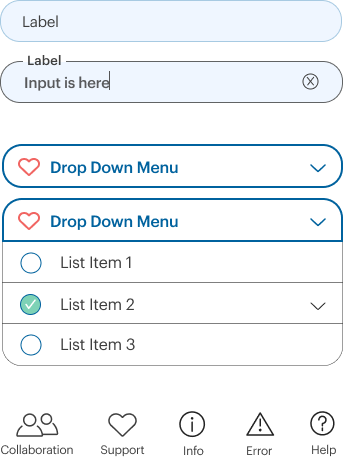
How to have an app with a lot of function but not overwhelming. Clear hierarchy. Remove a line or a border to create more white space can go a long way.

Accessible and inclusive.
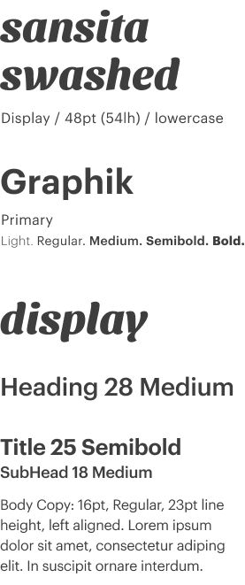
It’s for usability but it’s also just being considerate and inclusive. The challenge is mostly letting go of something I want for what the users need.
*Note* If the prototype is being finicky refresh this page or click the white bar with the Figma logo (bottom) to open the full-version in your browser.
